The Faster You Rise, the Faster you Fail: Fast's Pitch Deck Teardown 💳
The deck that helped Fast raise $20M and fuelled Silicon Valley's most insane FinTech story
One-click checkout provider Fast is undoubtedly one of the most insane FinTech stories in Silicon Valley to date. In fact, it might be one of the craziest startup stories in the whole world, surpassed only by Elizabeth Holmes-led Theranos.
Despite having raised a whopping $125 million in just 3 years from a number of prominent VCs, including FinTech giant Stripe (which led both their Series A & Series B), being one of the hottest FinTech startups in payments, and even standing close to becoming a unicorn, Fast failed miserably.
In case you missed it, I highly recommend checking my deep dive into the one-click checkout provider. I took a holistic view, mapped out all the red flags, and most importantly focused on the lessons to learn. For FinTechs & tech startups, venture capitalists, and startup employees.
Too fast, too luxurious: lessons from the failure of Stripe-backed Fast
Considering you now know the story, let’s take a look at where it all began. Let’s teardown their pitch deck that was used to raise $20 million from Stripe (which led the round), Index Ventures, Kleiner Perkins, Susa Ventures, and Global Founders Capital laying out both the good & the ugly.
P.S. I must note there are two versions of the deck. In order to get the full picture, I will use both of them with a bigger focus on the one I believe is earlier.
Title Slide
This is an excellent example of what the title slide should look like. Not only it has neatly incorporated branding and a logo. Rather with only 11 words, it has the name of the company and two one-line descriptions of what it does. Both for you and your customers.
More importantly, it also showcases the product, so one could easily understand what Fast is all about. As I’ve earlier written about Coinbase, it’s a brilliant way to showcase that the company has a live and usable product.
Bonus points go for the merchandise (=Fast Swag), which shows that the company cares about its brand and community, and knows how to do marketing. We have learned by now that marketing was probably the only thing they did brilliantly. Though not for their customers, but for venture capitalists… 🤷♂️
The later version of the pitch deck (seen below) had a different and very minimalistic design.
It’s simple, it’s beautiful but it doesn’t really deliver the three essential elements a title slide needs (to feature your brand & logo, highlight your value prop & outline the purpose of the deck). So unless you are raising from investors who already know you and were involved with you in the previous funding round(s) (like in Fast’s case), don’t do this.
The Solution/Product
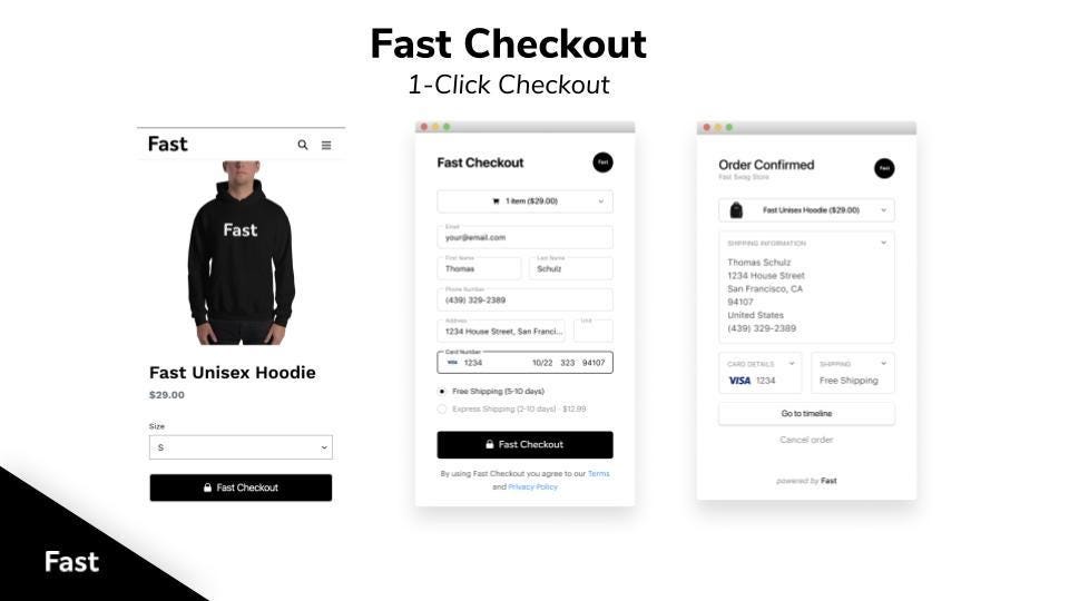
In the second slide, Fast jumps straight to their product. It’s clear that they are offering a one-click checkout solution. A very interesting element here is the ability to make changes or cancel your order before your card is charged. I’m not sure whether anybody is doing that even today, so that’s pretty unique for sure.
What’s not clear though is the zero fraud promise. We all know how sensitive the fraud topic is for anyone in payments (or, as a matter of fact, business in general), so this promise from Fast should have definitely raised some eyebrows or even excitement. Yet, it hasn’t been explained at all in the whole deck, so for any serious investor that should be a red flag immersion 🚩
Because you shouldn’t promise what you can’t deliver.
More on Solution/Product
As you might already sense it, Fast is very different from nearly all other companies because it focuses heavily on its product. Hence, the next two slides are dedicated to exactly that.
One thing you should immediately notice is that Fast hasn’t yet mentioned the problem they are trying to solve - they went straight to the solution. What’s even crazier is that they won’t mention the problem in the whole deck.
Someone might argue that this is a clever move because Fast’s vision was to make payments so seamless that buyers would forget they are even buying/paying for something. And that might make sense because cart abandonment is quite an issue in e-commerce, hence, the faster the checkout, the lower the drop rate, and the better the business.
But this kind of thinking is fundamentally wrong.
As you might remember from my earlier dive into Fast, the biggest problem with one-click checkout is that it’s a really tough business model - it has no real moat, so it’s all about scaling and scaling fast. And scale is often very difficult in payments.
An even bigger problem with Fast was that there was practically no differentiation and nothing unique (more on that - later) in what they were offering (apart from great marketing again). Fast was like Shop Pay or Amazon Pay, just that… There’s no just, that was literally it.
Therefore, the key takeaway here is that first and foremost your business idea has to make sense and should be built on a valid business model. If there’s nothing unique or different in what you do, then you have to be very clear in outlining how you can win in such a market.
Second, irrespective of the above, it is very risky not to outline the problem you’re trying to solve, especially if your readers are not familiar with your industry/technology. You might fool someone in the beginning but in the end, the fool will be you.
Even More on Solution/Product
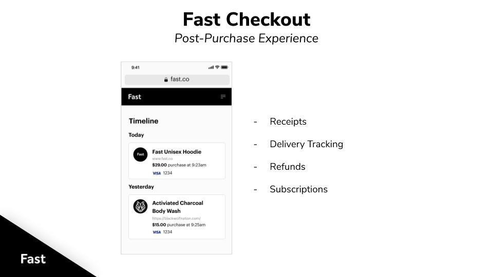
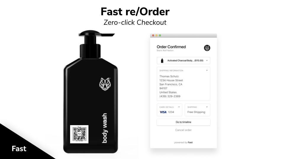
The next two slides are again about the product. But these two are better because they indicate what Fast can do besides just offering a faster payment.
Fast’s promise here was that it will integrate the entire purchasing cycle and will also handle subscriptions. In addition to that, the QR code displayed could potentially be another value add as it allows you to scan a product and immediately pay for it without any other action.
But again, apart from good visuals, the fundamentals (= value proposition & business model) haven’t been addressed. QR codes have been with us for ages, refunds are default in any payments business, so maybe only the delivery tracking is something unique. But can you build a payments business just on it alone? You know the answer.
Distribution
The next two slides are dedicated to the distribution. And to a very limited extent - market size.
This is where things get messy again.
On one hand, Fast gives you the impression that there’s no point in talking about the market size of online payments as online retail is growing every year, not the mention that global digitization drives more offline-only businesses to switch online. Also, running on payment card rails and being platform-agnostic (+ already being connected to the largest e-commerce software in the market) should give another solid boost.
Yet, the key problem here is that there’s no other way of doing things. If you’re not platform-agnostic and API-first, you’re pretty much done from Day 1. So, card payments and easy installation take you literally nowhere. An even bigger problem was that Fast wasn’t really agnostic at all when it comes to payments. The biggest difference to one of its key competitors was that it allowed merchants to use a variety of payment gateways, not just Stripe (which was the only one in the case of Fast).
Therefore, in your deck, not only should you talk about the market size, but also outline the reason(s) for how and why you can win in that market. One of the key questions to answer in this section is thus this:
Why and how your company will become the global standard in X industry?
Another Use Case
Although it had very little traction, Fast also had an identity management solution called Fast Login. This is the slide dedicated to exactly that.
One thing is clear here - the synergies between both their products were really great. The same way you use Apple Pay for payments, you can easily use Apple to sign/log in. This obviously adds extra value & convenience for the user and easily locks him/her into the company’s ecosystem. And that was what Fast was after.
Together, it could have been a killer feature and a potentially world-conquering solution. But for the reasons outlined earlier, it was never meant to gain traction.
Managing Risk
If you’re in the money & identity business aka FinTech, security and compliance are crucial. This is what Fast wanted to address here, trying to assure the investors they know what they are doing.
The problem is that it says very little about their procedures & processes, not to mention that it says nothing about compliance, which is one of the most critical pillars you build and scale your payments business on.
Naming Stripe was probably not a choice but a requirement as they were Fast’s investor before. Yet, I would argue that instead of showing de-risking, it was probably their biggest risk in the payments field. Because there’s nothing riskier than having a single partner/provider as your payments processor. It ended up being a bad business decision too.
Therefore, if you are trying to be serious about security in your pitch deck, really be. Otherwise, don’t show anything at all.
The Team
The team is critical. You should not only list your team members but also talk about what makes your team particularly well suited to solving the problem. Most importantly, this should be about the founders. Nobody cares about your advisors.
From a glance, it looks like a brilliant team slide. It is clean and eye-catching, and most importantly it demonstrates the ability of each person that is put forward with their achievements. The bonus goes for the fact Fast was already operating a remote team.
Yet, if someone would have done a quick internet search on Fast’s CEO Domm Holland, they definitely would have found some serious red flags. I’ve outlined them all earlier here.
Furthermore, Fast’s co-founder & COO has now changed her role and is currently not a co-founder anymore. It went from this:
To this:
In addition, it now appears that Barr Allen was removed from the company register of Fast AF Inc before the 7th of March: a month before the company would shut down. This change in corporate structure was not communicated to employees at all and just adds a further nail to Fast’s coffin.
Competition
One of the last slides in Fast’s pitch deck was dedicated to a competitive environment overview. And it’s very bad. In fact, it’s so bad that it’s probably the worst slide in the entire deck.
Let me explain.
First and foremost, there’s definitely a better way of doing this, which is a simple comparison table. Fast could easily have merged the two visuals into one, and it would then have highlighted Fast USPs much better.
On the winning promise:
Being platform-agnosticism isn’t unique. It’s a must-have from Day 1, otherwise, you aren’t competitive and your solution is deemed being useless.
Customer centricity is great, but this is only a promise which is vague and just hangs in the air. I’ve already talked about security (which is a joke from what was presented).
This is either purposely wrong or just shows a lack of understanding and/or research done in the payments space. Apple has launched Sign In with Apple back in 2019 (it was already available when Fast was raising Series A). If we would take Google as a competitor too (which we definitely can), then it’s even worse as Sign In with Google is available since 2013. Another big red flag 🚩
You cannot really commit to being “the largest” in anything (especially in paments) since distribution is often the most difficult part. Not only does it sound naive, but also it adds nothing to the slide and overall context.
Long story short & the takeaway is this: use comparison tables if possible, do your research thoroughly, and again - don’t promise what you can’t deliver.
Investor de-risking
This is a brilliant slide that definitely created FOMO (because nothing pushes investors to invest faster than knowing that their peers are already invested) and speeded up the company’s fundraising dramatically.
When you have backers like Fast did, you should always show them.
Traction
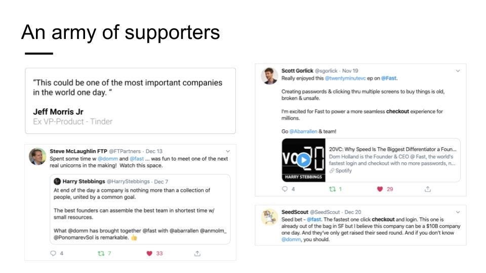
The last two slides of the deck are dedicated to showing traction. But Fast does it in a different way. Yet, it still delivers.
These slides are great because not only do they show that Fast already has a community of supporters/users but also demonstrate there’s a (fake?) need for their product and urgency from the market. Put together, this again creates FOMO, and that’s exactly what every startup should strive for when closing out their pitch.
Yet, what is important to note here is that if you have tangible traction, you should always show the real numbers. Qualitative feedback is great and could be used as a compliment. But numbers always win because numbers don’t lie.
Lessons
Fast is a brilliant case study beyond just FinTech because there’s lots to learn from it. In addition to earlier lessons, this deck teaches us quite a few things too. Here’s what I think you should take away from this teardown:
The title slide is very important as it creates the first impression on your startup and the business that you’re building. Unless you are raising from investors who already know you and were involved with you in the previous funding round(s) (like in Fast’s case), don’t use a minimalistic approach as Fast did.
Always remember that your business idea has to make sense and should be built on a valid business model.
It is very risky not to outline the problem you’re trying to solve, especially if your readers are not familiar with your industry/technology.
In your deck, not only should you talk about the market size, but also outline the reason(s) for how and why you can win in that market. And please - don’t promise what you can’t deliver.
If you are in finance where security & trust is crucial, remember: if you are trying to be serious about security in your pitch deck, really be. Otherwise, don’t show anything at all.
The founding team is crucial, so always do proper due diligence on them (this one is for the investors).
To overview the competitive environment, use comparison tables if possible, do your research thoroughly, and again - don’t promise what you can’t deliver.
When you already have backers like Fast did, you should always show them.
If you have tangible traction, you should always show the real numbers. Qualitative feedback is great and could be used as a compliment.
I hope this was valuable to you and will bring some food for thought and inspiration when you are preparing your pitch deck. Go build!
If you found this useful, first - go Premium:
Then - share it with others and spread the word:


